

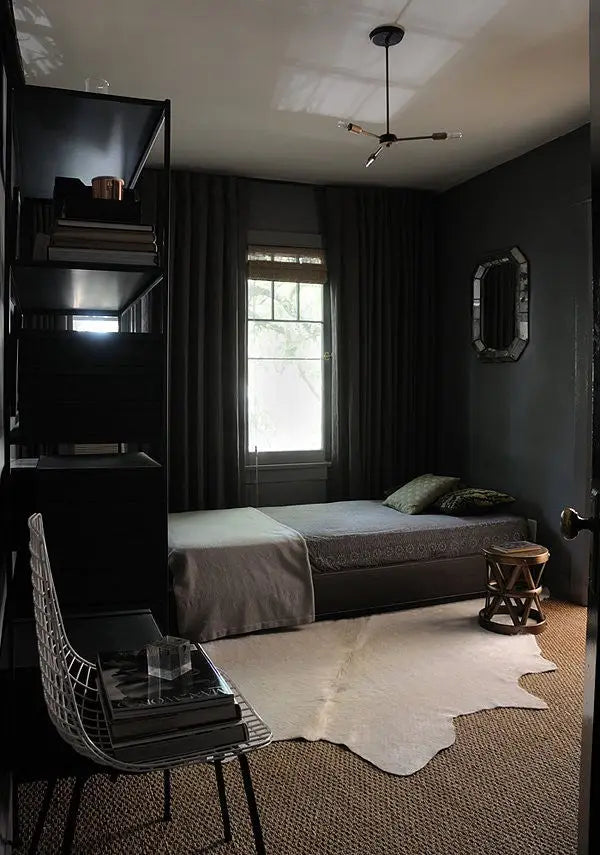
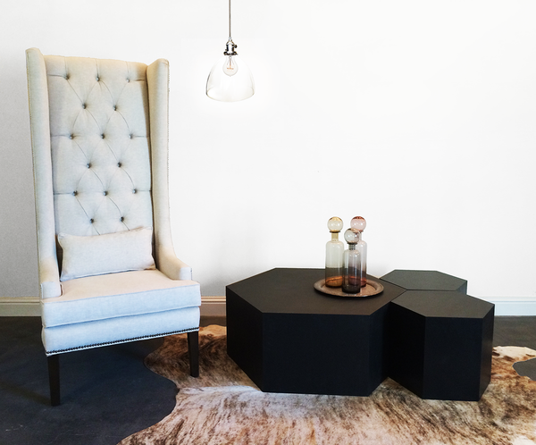
1. Matte Black is Back
Don’t be afraid of deep, dark, lush paint. This year is about mood — make sure the room you design is bathed in it. Look toward muddled tones and mix subtle shades of dark tones to create a sexy, cozy vibe. Don’t go gothic tough — we’re not talking stark whites & blacks. You’ll want rooms to contain more than three shades of dark colors to create the effect.

2. Nautical Rope with a Twist
Anchor Vice designer Sally Breer, “… created a bit of an industrial look with a concrete countertop and steel-and-rope light fixture … we wanted the bar to feel raw and industrial.”
Ship rope cord on it’s own? Ho-hum. Mix it with the edgy, raw vibe of industrial? Now you’re talking. The balance of traditional nautical with modern raw metal creates a unique effect that’s both stunning and completely familiar. You’ll also want to “create a unique centerpiece” for your main room — consider hiring a local designer & manufacturer (hint hint, maybe us?) to help you get just the right piece to stop everyone in their tracks.
3. Craftsman Artistry
Sure, it may sound like a bunch of Whole Foods mumbo-jumbo, but it’s really just a fancy way of saying hand-made stuff that’s pro-quality. Avoid amateur DIY (I’m looking at you Etsy) and prefer skilled designers that know how to execute their designs masterfully.
“It’s no surprise that handmade goods from skilled artists are a key part of how to execute [authenticity].”
UglyDuckling.com
Focus on hand-made furniture & lighting that doesn’t reek of mass-manufactured clones. Try to avoid coherency for the sake of it by finding the voice of each room. Let each space be unique, and partner with designers & manufacturers that can help you make it what you want it to be.
4. Touch me, I’m textured!
A big, soft, comfy sweater. Sleek, smooth, silky metal. Luxrious, evervescent silk. Textures that scream “touch me!” are fun to work with and add depth and dimension to most room styles. Avoid over-used white lucite and bland materials that would delight fingertips as much as a plastic ruler. Play with surfaces: rough, pitted, grooved, soft, hard, warm, cool, etc. Some ideas? Think Belgian linen, natural concrete, rough sanded and sealed wood, clay, copper, cowhide, ship rope, sweater cotton, porcelain. Get creative, but you might want to stick to two to three textures per room unless you’re a true master of texture.
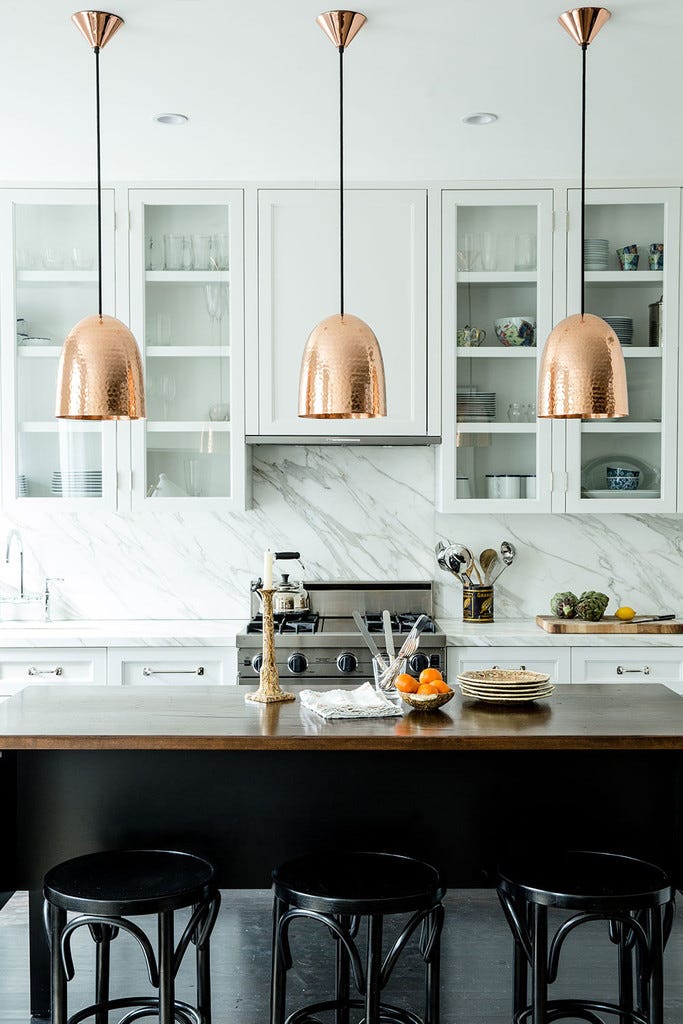
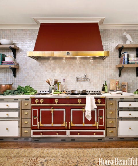
5. Warm Metallics · Copper, Gold, Brass
We’re so happy about this one. We absolutely adore the warmer metals and frankly have been a bit sore that they’ve been ignored for so long. Copper can turn any room into a dapper, classy place. Gold (no, we’re not talking tacky gold) mixed with industrial and/or nautical brings humble luxury to a space. Brass is a classic, but you’ve got to be subtle about it. Not to toot our own horn, but we’ve done a pretty nice job infusing these metals into our lighting and hive tables. We recommend using these metals as centerpiece or as accents. Did we mention how well copper mixes with matte black and moody rooms? Well, it does. And it’s amazing.
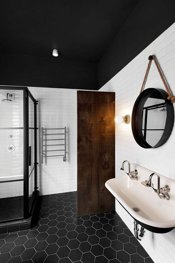
6. Organic Geometric Shapes · Hexagons
Bees love ‘em and so do we. Geometric shapes are like the visual equivalent of texture. They work as wallpaper, flooring, and espcially as furniture. The trick is to get the rigid lines to feel warm and organic — hint: don’t use lucite. By combining materials like wood or warm metals (copper, bronze) with structured, geometric shapes, you get a sort of complementary opposition that really wows. We’ve got a all kinds of wood hexagon tables that come in a variety of finishes that really highlight how to pull off this look.

7. Marsala · The Pantone Color of 2015
Let’s face it: dark, moody colors need some balance. You can’t have all that luxurious depth without something to offset it, right? Well, make way for Marsala. Yea, it’s a wine. But more importantly, it’s a deep burgundy red that will give old rooms new life and bring new rooms to the definition of exquisite. Keep your eyes out for creative ways to use the color, but be careful: it’s easy to misuse this heavy color. Remember that it’s used to make a statement or accent pieces unless you really know what you’re doing. The right amount of wine can make a good dish great, and it’s no different with this Marsala.
In closing
If you’re designing a home for yourself or your clients, we hope this list will give you some great ideas to wow anyone that walks into your spaces. We’re happy to help if you need us, but we’d love to see what you can do with these trends for 2015!